
Large wall art is one of the fastest ways to make a home look more expensive. Not because bigger is automatically better, but because scale changes everything. A single oversized piece can turn an empty wall into a statement, create structure in a room, and instantly make the space feel “finished.”
But here’s the problem: large art can also look awkward if it’s placed wrong, sized wrong, or styled without intention. The good news is you don’t need an interior designer to get it right. You just need a few simple rules that professionals use every day.
In this guide, you’ll learn how to style large wall art in a way that feels balanced, modern, and high-end—without overthinking it. If you want inspiration while you read, you can explore modern canvas styles on MusaArtGallery.
Why Large Wall Art Works So Well in Modern Homes
Modern interiors tend to be clean and uncluttered. That looks great… until the room starts to feel empty. Large art solves that problem because it creates a focal point and fills visual space without adding physical clutter.
Instead of adding more furniture or random decor objects, large art gives you impact with one piece. It also makes your room look more intentional. A big canvas tells the eye, “this space was designed.”
And most importantly, large art makes standard furniture look more premium. The same sofa under a small frame looks basic. Under a large statement canvas, it suddenly looks styled.
Choosing the Right Size (The Rule Designers Always Follow)
The biggest mistake with large art is buying something that’s still too small for the wall. People get nervous and downsize, but in most rooms, going bigger looks better.
A designer rule that works almost every time is:
Your artwork should be around 60% to 75% the width of the furniture beneath it.
So if your sofa is 220 cm wide, your wall art should ideally be around 130–165 cm wide. This makes the room feel balanced instead of top-heavy or empty.
For beds, the same concept applies. If you’re hanging art above a headboard, the piece should feel wide enough to anchor the wall. Otherwise it looks like it’s floating.
One Big Piece vs. a Set (What Looks Better?)
Both options can look high-end, but they create different moods.
A single oversized piece looks bold, modern, and confident. It works best when you want the wall art to be the main focal point of the room.
A two-piece or three-piece set looks more structured and “gallery-like.” It’s perfect for wide walls, long dining areas, or bedrooms where you want something big but not overpowering.
If you’re a beginner, one big piece is often the easiest because it’s harder to mess up. It becomes the hero of the room and everything else can stay simple.
The Perfect Height (This Is Where Most People Mess Up)
Most people hang large wall art too high. They treat it like something that belongs near the ceiling. Designers don’t do that.
The goal is to connect the art with the furniture beneath it.
A great rule is: the center of the artwork should be roughly at eye level (around 145–155 cm from the floor). If it’s above a sofa, keep it lower and closer to the furniture so it feels connected.
If you leave too much empty wall space between the sofa and the art, the room looks disconnected. The furniture feels like it belongs to one zone, and the art feels like it belongs somewhere else.
How to Style Large Wall Art Around the Room
Large art looks best when the rest of the room supports it, not competes with it.
If the art is bold and colorful, keep surrounding decor more neutral. Let the canvas be the statement.
If the art is minimal or black and white, you can add texture and warmth through furniture, rugs, wood tones, or soft lighting.
If the room already has a lot of patterns (like a patterned rug or textured wallpaper), choose art with cleaner shapes so the space doesn’t feel chaotic.
Design is all about balance. The more visual energy your room already has, the calmer your art should be. The calmer the room is, the bolder your art can be.
The “Frame Effect” (Even If It’s Canvas)
Even when you’re using canvas prints, you still need to think about “framing” visually.
Large artwork looks cleaner when it has clear borders or structure around it. If your art has a very soft edge and fades into the background, it can look less intentional on big walls.
That’s why bold contrast art, strong composition, and clear shapes often look best in oversized formats. The piece holds the wall properly, even from far away.
If you want to make your large wall art feel even more premium, you can also style it with lighting. A simple wall light or warm ceiling spotlight above the canvas adds a luxury gallery feeling instantly.
Best Rooms for Large Wall Art (And What Works Where)
Large wall art can work almost anywhere, but some places are perfect for it.
The living room is the most popular. One large canvas above the sofa instantly sets the tone of the entire home.
The bedroom is another great spot, especially above the bed. The key here is choosing something calmer, since it’s a rest space.
Dining rooms are underrated. A big statement piece here adds energy and creates a stronger atmosphere.
Entryways with tall walls are perfect too. A big canvas makes the first impression feel expensive and intentional.
Even hallways can work, especially the end of a hallway. A large piece there creates a destination and makes the home feel designed.
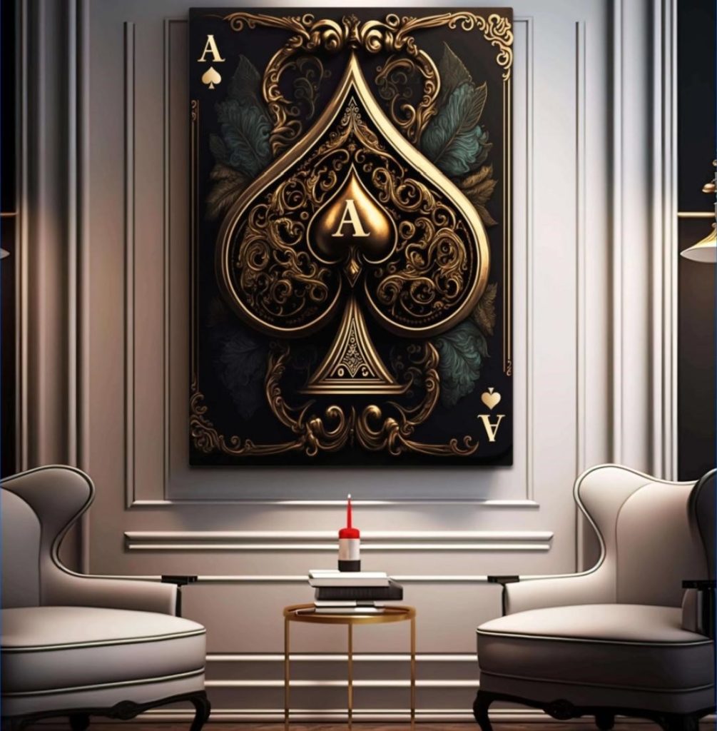
Styling Bold Theme Art (Like Poker Art) Without It Feeling Too “Gimmicky”
Theme art can look incredibly modern if it’s done right. The key is to treat it like a design statement, not a novelty decoration.
For example, poker art can look insanely good in modern interiors when paired with clean furniture, neutral tones, and strong contrast. It adds personality, attitude, and a little luxury vibe—without needing extra clutter.
This style works especially well in:
- home offices
- entertainment rooms
- lounge corners
- modern living rooms with dark accents
- masculine interiors with black, grey, and deep tones
If you want to explore this style, you can check out poker art and see how playing card designs can work as statement wall pieces.
The Secret to a “Designer Look”: Give the Art Breathing Room
Large wall art looks best when it isn’t surrounded by too many random objects.
Avoid placing too many shelves, mirrors, or small decorations around it. A big canvas needs space to feel powerful. If you fill the area with too much extra decor, it loses its impact and starts to look messy.
Instead, keep the styling simple:
- one big canvas
- clean furniture beneath it
- maybe one or two simple decor accents nearby
This is how designers create that luxury, minimalist look people love.
Final Thought: Large Wall Art Isn’t Just Decor—It’s Architecture
When you style large wall art correctly, it doesn’t just decorate the room. It shapes the room. It becomes the visual anchor that everything else revolves around.
Choose the right size, hang it at the right height, balance it with the furniture, and give it breathing space. Do that, and your home instantly looks more intentional and expensive.